
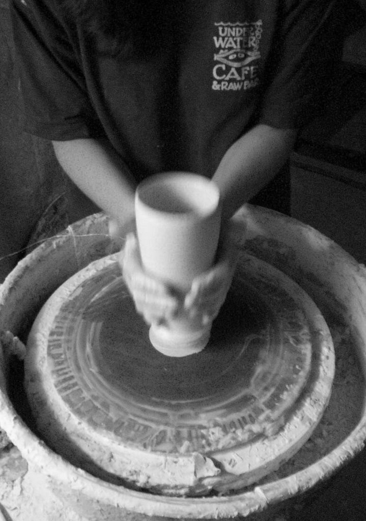
 I don't think there has ever been a time when I haven't had tons of color on my pots. I know back when I was in school, sometimes I felt like the only one not doing wood fired, earthy tones. I constantly questioned this decision whenever I sat in Critiques with my fellow students and all the professors went on and on about the flame color on the pots. I also have always gone back and forth with the "more, more, more" decorative issue on my pots. I've often looked at John Glicks works and wondered how he can get so much information on one pot and make it work so well. I find this to be very hard and I know sit again struggling with the thoughts of color, line, form and surface when I think about my pots.
You'll see in the last post that some of my pots have more than just the red accent on them. I am now introducing some chartreuse and I would even like to bring some yellow into the mix. The trick here is getting the right red, with the right aqua and glaze colors that I have for my palette.
Today I turned to the good old color wheel for some help. I have taught color theory in the past but many years ago and know I think I need to re-visit my monochromatic, analogous and complementary colors to see where to go from here. Possibly some new glaze colors??? My resident"critic" that I live with had some feelings about my accent colors last night. I thought maybe I needed to bring in some more experts on the issue, so today I'm going to meet with some of my pottery buddies to pick their brains. We'll see if I can come up with some solutions.


2 comments:
After looking at your prior post- I do like that red you have with the amber only (on the box). Still think that an "oranger" red would work best with the other colors you use.
Today I looked at what seemed like a million colors, glazes today. I think my eye's hurt!
I may send you some "images" of color and see what you think.
I need to make up some tests.
Thank you so much for the input. ( Really that red does not look good with the amber...I think that images is'nt right..colorwise).
Jen
Post a Comment