


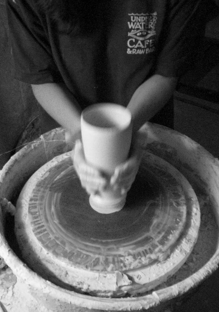
I still think these are a tad bit dull in nature even though I had the "vivid color"setting on. Perhaps its just the nature of my camera. At any rate, I think they look a lot better. Please chime in if you have anything else to add about my photo adventures!
(This is sort of an aqua overload!)


15 comments:
Jen - these photos look great. You've done such a good job with glare issues! The only thing I think might help is to have a little shadow at the bottom -- so the pieces don't look like they are floating. In the first & fourth photo you've done that & I think they are more successful.
The work is gorgeous!
holy CATS I love your work :) there, I chimed in...
I think your glaze is looking a bit matte in these, the pics don't clearly represent just how "juicy" your glazes really are, that's one of the things I love most about your work,also still looking a bit pink. When Gerry shoots pics for me he puts his camera on the tungsten setting,and he shoots with a 70-200 for depth of field. I don't have that on my camera, but that might help. If I could get him to be still for a second I could ask his opinion for you.... definitely getting there, but you want the photos to be right, your work is so wonderful!!
I think theses comments are great and I am sure you can list them on ETSY... Go for it!!!
Hey, these look good. I think you could work on it forever, but you are certainly ready for Etsy. Sure a professional like Randy or Gerry would do a killer job, much better than we can do. But they have years of experience and much better equipment. Good job, get that Etsy site up!!!
the photos look great jen. if the colors on the pieces are accurate, then i think you've mastered it. i getting ready to break out the photo tent today. not looking forward to it but it has to be done. i think your pots will do well on etsy.
The pictures look great! The one thing that might drive you nutz though, (it drove me nutz), is the ETSY format is a general 1000 wide by 806 high... a horizontal rectangle.
Your photos look great. I'm trying to learn how to take my own images as well. I hope mine turn out as nice as yours.
Great. Great. And More Great!
That's interesting about the format... I have always uploaded them as a square... it works out ok...
they look great from here!
Ok, so I don't know what I'm talking about :) I showed the pics to Gerry and he said they look great! I think I just got used to seeing your work in person at Claymakers and no photo is going to show how great your glazes are and the depth you get with them, so from Gerry "well done" !!!
Definitely better than anything I would shoot, for sure.....so don't listen to me (lol)
Jen, Again, I think your pics are great. And nice pots too!
Sweet. You got the thumbs up from a professional. You're good to go.
I am new on your blog, and very peacefully inspired by the color, form and texture with springs of lightness and joy from viewing this work. beautiful
Post a Comment