

I've been traveling around with my Grumbacher color chart in the car and its also been sitting here next to the computer while I've been grading papers and such. This chart is so fun and I've forgotten how mesmerising color can be. When I taught design class at ECU one of my favorite projects to do with the students used this chart, a pattern and some great paper called "color aid". You could get every shade of any color in this stuff. My kids would go crazy if I still had some of this stuff! Quaid has enjoyed playing with this chart in the car on the way home from school. I"m happy to know his art teacher, whom I love is teaching all kind of color theory to all her students!

I guess I should say that I'm trying to find more accent colors to use on various parts of my pots. Finials, birds, flowers, handles..ect. are the focus. Last year I started in introduce a little red on my pieces but I've found that I really don't enjoy this combination with my Amber or Green glaze so the aqua that I use is the only one that is getting this added treatment.
 At the moment I'm focusing on a compliment for my amber glaze. What shade of blue or purplish blue should I go for. And should I even add blue back into my glaze palette. Boy does blue get such a bad rap in the pottery community although I think it is making a comeback.
Bright vivid colors are so alluring to me -happy, crazy, child-like and fun. Since this applies to me I really would love to bring this into my work more. But with that said, I think adding lots of different colors to your work is so hard. Especially if your pots have so much going on. Many,many things to consider. I wonder if I'm up to this challenge and have the time to explore this more.
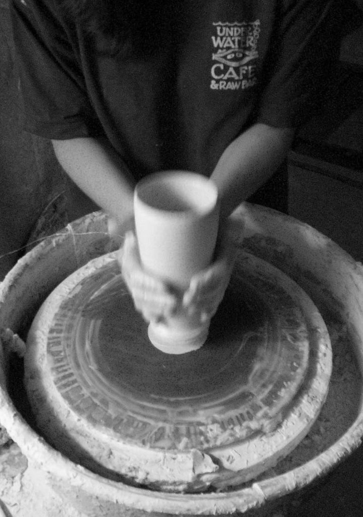
 For the time being, what time I have.. I'm going to do some tests, slowly, maybe experiment with some commercial glazes and keep checking in with my pottery buddies for their input about this and my work. It is such a great thing to have good friends and folks near by that I can say "Hey...how awful is this? What do think? What should I do...ect."
Today I'm finishing up a special order for some bottles. I'm adding a bit more colored clay to these. I have the chartreuse and now I've added some saturn orange to the mix. Small steps......


4 comments:
know what you mean about blue having a bad rap but when your trying to go with orange, blue's hard to beat
Hey, I've got to get me a color wheel! Ha. Nice images. I like that one with the aprons, where did it come from? I've been looking at lots of pots w. color. Crazy stuff and hard to know if it's what I want to do. For now I'm sticking to my 'dots'. We'll have to get together again soon.
Not that I know anything about anything, but I think there ain't nothing wrong with blue.
Well yes....I guess every occupation has these issues. Do you look down your nose at RedRoof Inns??
Post a Comment